
PROMPT PUBLIÉ PAR LA SOURCE
=== ARCHITECTURE & VISION ===
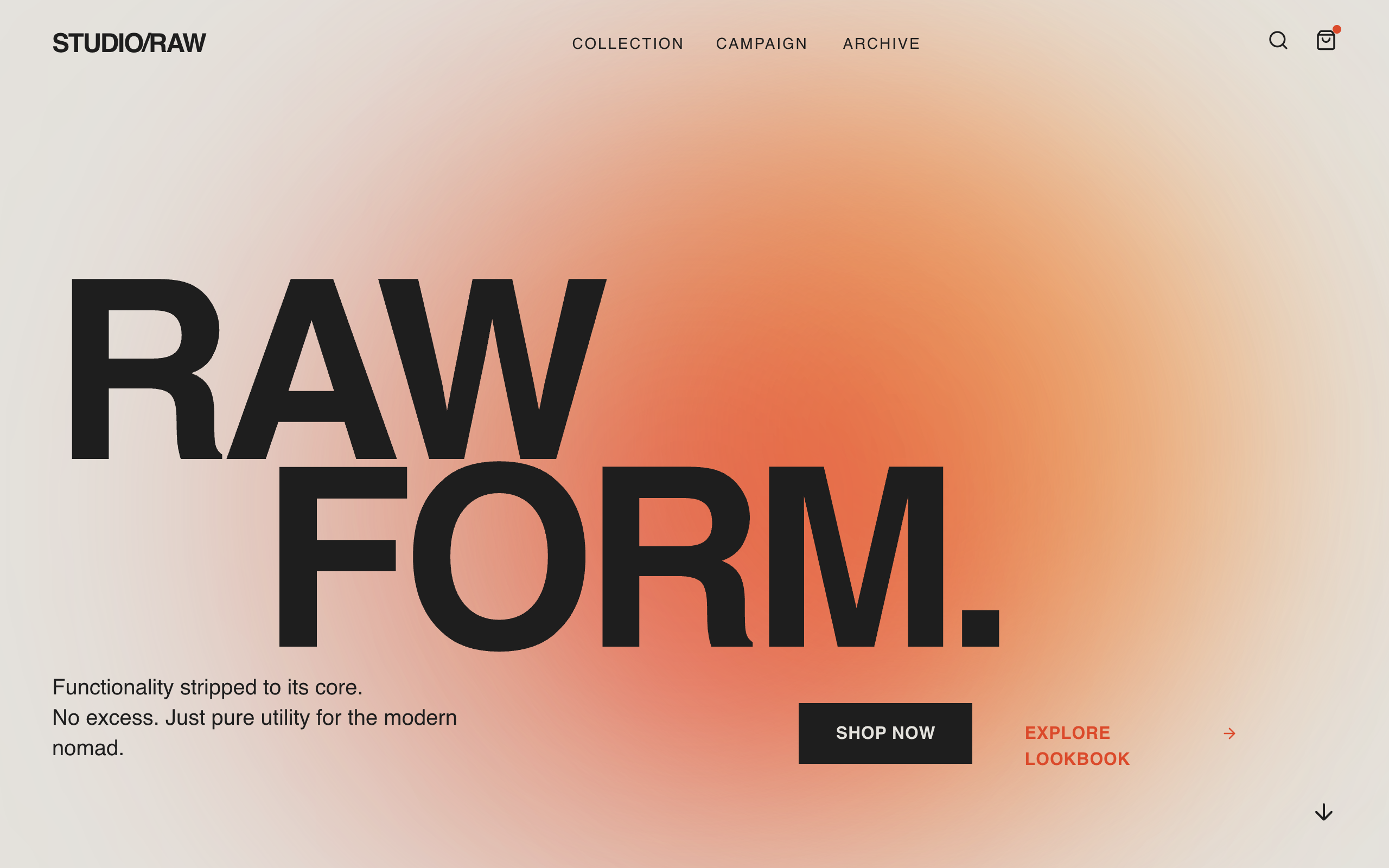
Raw Form is a high-contrast, brutalist design system that prioritizes typographic drama and atmospheric depth. It replaces traditional container-heavy UI with massive type breaks, soft organic gradients, and a sharp, grid-based hierarchy.

=== STYLE & DIRECTION ARTISTIQUE ===
• description: The style blends the raw energy of Swiss Brutalism with a refined, warm color palette. It uses 'Clash Display' for heavy headlines and 'Satoshi' for functional sans-serif body text. The color scheme is anchored by #E4E2DD (Base), #1E1E1E (Primary), and #DB4A2B (Accent Red). Animations are smooth, utilizing cubic-bezier curves for a premium feel.
• prompt: Apply a Brutalist Poster aesthetic. Background: #E4E2DD; Primary Text: #1E1E1E. Typography: Use 'Clash Display' for headings (700 weight, tight tracking -0.05em, leading 0.75) and 'Satoshi' for body (400-500 weight). Accent Colors: #DB4A2B (Red-Orange), #F8A348 (Warm Orange), #FF89A9 (Soft Pink). Gradients: Use large, soft-blurred radial blobs (100px+ blur) with `mix-blend-mode: multiply` behind typography. Global Animations: Implement a slide-up entrance for all elements using `cubic-bezier(0.16, 1, 0.3, 1)` over 0.8s. Selection Color: #DB4A2B with white text. Scrollbar: 8px width, #DB4A2B thumb, #E4E2DD track.

=== STRUCTURE & SECTIONS ===
• description: A vertically-oriented layout featuring full-viewport typographic heroes, massive category dividers, and borderless product grids.
• prompts: [{"part":"Navigation","prompt":"Minimalist fixed navigation. Left: Brand logo in 'Clash Display' (bold, uppercase, 2xl). Center: Text links in Satoshi (medium, 14px, tracked out 0.1em). Right: Icon set (Search, Bag) using 20px Lucide icons. Apply `mix-blend-difference` on mobile; standard dark text on desktop."},{"part":"Hero Section","prompt":"Full viewport height. Background features three large, blurred blobs in #DB4A2B and #F8A348 pulsing slowly. Headline: 'Clash Display', 18vw size, uppercase, line-height 0.75, with second line indented 15vw. Subtext: Max-width 400px, 20px font size. CTA: Primary solid black button with white hover slide-in effect; Secondary text link in #DB4A2B with arrow icon."},{"part":"Product Grid","prompt":"Responsive grid (1 col mobile, 3 col desktop) with 16px horizontal and 64px vertical gap. Items: 3/4 aspect ratio images with subtle hover scale (1.05). Metadata: Product names in bold uppercase Satoshi, 14px, tracking 0.15em. Price in #444444. Hover state triggers an #FF89A9 color shift on title."},{"part":"Category Divider","prompt":"Full-width section with 128px vertical padding. Background contains a faint radial gradient (#F8A348/20%). Headline: 'Clash Display', 12vw, uppercase, tracking-tighter, slightly transparent (opacity 0.9). Right-aligned or left-aligned depending on section sequence."},{"part":"Campaign Block","prompt":"Section background #D9D6D0. 12-column grid. Left 8 cols: 'Clash Display' headline at 6vw, leading 0.9. Right 4 cols: Vertical stack featuring thin dividers (#1E1E1E/20%) and 'Read More' links with arrow-up-right icons inside circular borders."},{"part":"Footer","prompt":"Background #1E1E1E, text #E4E2DD. 4-column layout. Column 1: Large brand logo and social icons. Columns 2-3: Link lists in 14px Satoshi. Bottom section: Massive year indicator ('2024') in background-style text (#FFFFFF/10%) at 10vw size, right-aligned copyright notice."}]

=== COMPOSANTS CLÉS ===
• {"component":"Interactive CTA Button","description":"A high-contrast button with a directional fill animation.","prompt":"Rectangular button, no border-radius. Background #1E1E1E, text #E4E2DD. On hover, a white background (#FFFFFF) slides from left-to-right (transform -100% to 0) behind the text. Text color transitions to #DB4A2B on hover. Duration: 0.3s ease-out."}
• {"component":"Animated Gradient Blobs","description":"Soft organic shapes that provide depth behind text.","prompt":"Position absolute divs with `width: 60vw; height: 60vw;`. Colors: #DB4A2B and #F8A348. Apply `filter: blur(140px)` and `mix-blend-mode: multiply`. Animate using a slow pulse (opacity 0.6 to 0.9) and slight translation over 10-15 seconds."}
Superdesign UI · Texte publié par la source. Les références et réglages peuvent être nécessaires ; le résultat identique n’est pas garanti.
La source est indiquée pour consulter le contexte et les conditions de réutilisation.
← Continuer à explorer