
PROMPT PUBLIÉ PAR LA SOURCE
=== ARCHITECTURE & VISION ===
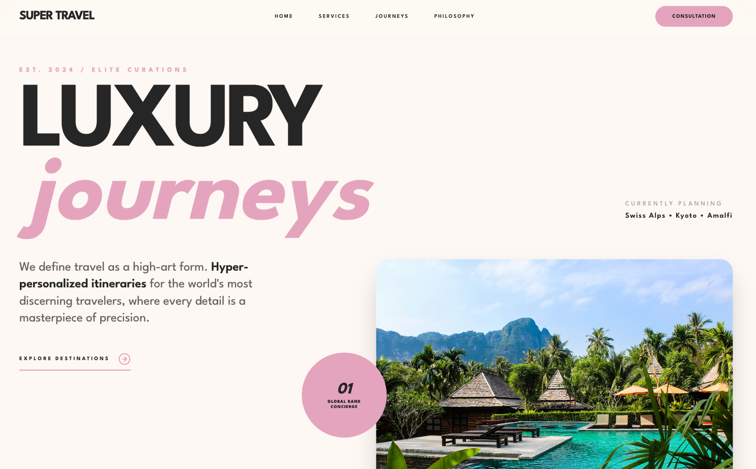
A luxury-focused, high-contrast design system called 'Super Travel' that uses bold geometric typography, a signature #e4a4bd accent, and a staggered grid to create a premium editorial feel.

=== STYLE & DIRECTION ARTISTIQUE ===
• description: The style is built on 'League Spartan' sans-serif, using weight and letter-spacing for hierarchy. The color palette is a warm off-white (#fdf8f3), charcoal (#262626), and a dusty rose accent (#e4a4bd). It uses smooth transitions (cubic-bezier) and grayscale-to-color hover effects to signify premium quality.
• prompt: Use 'League Spartan' as the primary font family for all elements. Primary background: #fdf8f3; Secondary background: #f5f0eb; Accent color: #e4a4bd; Primary text: #262626. For headings, use font-weight 700-900, tracking-tighter, and line-height 0.8. For utility labels, use font-size 10px, font-weight 900, and tracking 0.4em. Animations must use `cubic-bezier(0.16, 1, 0.3, 1)` with a 1s duration. Hover states on images should transition from grayscale(100%) to grayscale(0%) and scale up to 1.08. Navigation should be a glassmorphism effect with `backdrop-filter: blur(12px)` and a subtle 1px border at 5% opacity.

=== STRUCTURE & SECTIONS ===
• description: The layout uses a 12-column grid system with significant whitespace. It features a high-impact hero section, a clean 3-column service grid, and a signature staggered gallery for portfolio items.
• prompts: [{"part":"Navigation","prompt":"Fixed top navigation, 80px height. Use 'SUPER TRAVEL' in bold uppercase on the left. Center menu items in 10px uppercase tracking-widest (0.2em). Far right: a pill-shaped CTA button (#e4a4bd background, #262626 text) with 32px padding-x and 12px padding-y. Apply glassmorphism effect: background rgba(253, 248, 243, 0.8) and blur(12px)."},{"part":"Hero Section","prompt":"Full viewport height. Left side: Massive headline at 15vw font-size, line-height 0.8. Include one word in lowercase italics with #e4a4bd color. Below headline: 2xl body text in #262626/70 and an arrow-cta with a border-bottom-2px #e4a4bd. Right side: Large card with 24px border-radius, containing a grayscale-to-color image. Floating circular badge (160px diameter) in #e4a4bd with '01' italic text, positioned off-center with a slow 4s vertical bounce animation."},{"part":"Services Grid","prompt":"Background #f5f0eb. Headline should be 8xl font-size. Below, a grid of 3 columns separated by 1px borders. Each card has 40px padding. On hover, the card background shifts from #fdf8f3 to #e4a4bd. Icons should be 4xl size, transitioning from #e4a4bd to #262626 on hover. Text within cards: h3 bold uppercase, p small leading-relaxed."},{"part":"Portfolio Staggered Grid","prompt":"Two-column grid layout where every even item (right column) is offset downwards by 100px. Each item consists of a 3:4 aspect-ratio image with 16px border-radius. On hover, show a centered 96px black circle with white 'View Case' text in 10px font. Below images: category label in 10px #e4a4bd bold tracking-widest, followed by 3xl title and tag metadata separated by bullet points."},{"part":"Footer","prompt":"Background #f5f0eb. 12-column split: left 5 columns for brand logo and mission statement; right 7 columns split into 3 sub-columns for navigation, social, and locations. Use 10px bold uppercase headers with #e4a4bd color and a 8px offset underline. Bottom bar: thin 1px border, 9px font-size for copyright and legal links with #262626/30 color."}]

=== COMPOSANTS CLÉS ===
• {"component":"Floating Concierge Badge","description":"A floating circular element used for highlighting status or rank.","prompt":"A 160px by 160px circle with background #e4a4bd and text #262626. Includes a 3xl font-size italic '01' and 8px font-size uppercase tracking-widest text. Implementation: `animation: bounce-slow 4s ease-in-out infinite;` where keyframes shift translateY from -5% to 5%."}
• {"component":"Reveal-Up Wrapper","description":"Scroll-triggered entrance animation for all content blocks.","prompt":"Apply a class that starts with `opacity: 0; transform: translateY(40px);`. When active, transition to `opacity: 1; transform: translateY(0);` using `transition: all 1s cubic-bezier(0.16, 1, 0.3, 1);`. Use intersection observer with 0.15 threshold to trigger."}
Superdesign UI · Texte publié par la source. Les références et réglages peuvent être nécessaires ; le résultat identique n’est pas garanti.
La source est indiquée pour consulter le contexte et les conditions de réutilisation.
← Continuer à explorer