
PROMPT PUBLIÉ PAR LA SOURCE
=== ARCHITECTURE & VISION ===
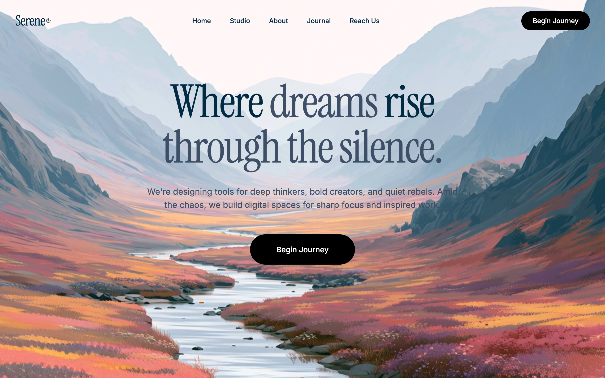
A minimalist, high-end cinematic hero design featuring Instrument Serif typography, a deep navy-and-white color palette, and fluid entrance animations over a full-bleed video background.

=== STYLE & DIRECTION ARTISTIQUE ===
• description: The style is 'Minimalist Editorial'. It pairs the elegant, high-contrast 'Instrument Serif' for headings with the functional 'Inter' for body and navigation. The color scheme revolves around a deep navy foreground (#0f172a) and black components (#000000) set against immersive backgrounds. Animations are reserved for entrance states using a 'fade-and-rise' transition to create a sense of unfolding luxury.
• prompt: Create a design with an 'Editorial Cinematic' aesthetic.

### Video link
https://designerstephen.github.io/public-assets/videos/serene-art-hero.mp4

### Typography
- **Display Font:** 'Instrument Serif', serif. Use font-weight: 400. For H1, use font-size: 80px (mobile 48px), line-height: 0.95, and tight letter-spacing: -2.46px.
- **Body Font:** 'Inter', sans-serif. Use font-weight: 400 for copy and 500 for UI elements. Size: 18px for sub-headers, 14px for navigation/buttons.

### Color Palette
- **Primary Text:** #0f172a (Deep Slate/Navy)
- **Muted Text:** HSL(215, 25%, 32%)
- **Primary Actions:** #000000 (Black) background with #ffffff (White) text.
- **Background Basis:** HSL(201, 100%, 13%) for loading/fallback.

### Animations & Micro-interactions
- **Entrance:** Apply a 'fade-rise' keyframe (from {opacity: 0, transform: translateY(24px)} to {opacity: 1, transform: translateY(0)}) with a duration of 0.8s and ease-out timing.
- **Delays:** Stagger elements by 200ms increments (0.2s for subtext, 0.4s for CTA buttons).
- **Hover States:** Buttons should use a subtle scale-up transform (scale: 1.03) with a transition duration of 0.3s.

=== STRUCTURE & SECTIONS ===
• description: The layout follows a centered hero hierarchy with a three-column distributed navigation bar. Content is layered over a full-width background video.
• prompts: [{"part":"Navigation Bar","prompt":"A 3-column grid container (Max-width: 1280px, px: 32px, py: 24px). \n- Left Col: Brand logo using 'Instrument Serif' at 30px size with a registered trademark symbol in superscript.\n- Center Col: Hidden on mobile. Horizontal flex list of 4 links using 'Inter' 14px Medium, spacing: 40px.\n- Right Col: Pill-shaped CTA button ('Find my dream') in solid black with white text."},{"part":"Hero Section","prompt":"Full-screen flex container (min-h-screen) with a background video layer. \n- Content Area: Centered vertically and horizontally. Max-width: 1280px.\n- Heading: 'Instrument Serif' H1, 80px size, negative tracking. Use <em> tags for stylistic emphasis (non-italic variant).\n- Paragraph: Max-width 670px, centered. Line-height: 1.625. Color: HSL(215, 25%, 32%).\n- Main CTA: Large pill-shaped button (padding: 20px 56px) with 16px Medium font weight, placed 48px below text."}]

=== COMPOSANTS CLÉS ===
• {"component":"Pill Action Button","description":"A high-contrast, rounded-full button used for primary conversions.","prompt":"Style a button with 'border-radius: 9999px', 'background-color: #000000', and 'color: #ffffff'. Use 'padding: 10px 24px' for small versions and '20px 56px' for hero versions. On hover, trigger a 'transform: scale(1.03)' with an 'ease-in-out' transition of 200ms."}
• {"component":"Staggered Entrance Container","description":"Sequential loading animation for the landing page hero content.","prompt":"Group hero elements (H1, P, Button) into a sequence. H1 triggers at 0s, P triggers at 0.2s, and Button triggers at 0.4s. All use a 24px upward slide combined with an opacity fade-in over 0.8 seconds."}
Superdesign UI · Texte publié par la source. Les références et réglages peuvent être nécessaires ; le résultat identique n’est pas garanti.
La source est indiquée pour consulter le contexte et les conditions de réutilisation.
← Continuer à explorer