
PROMPT PUBLIÉ PAR LA SOURCE
=== ARCHITECTURE & VISION ===
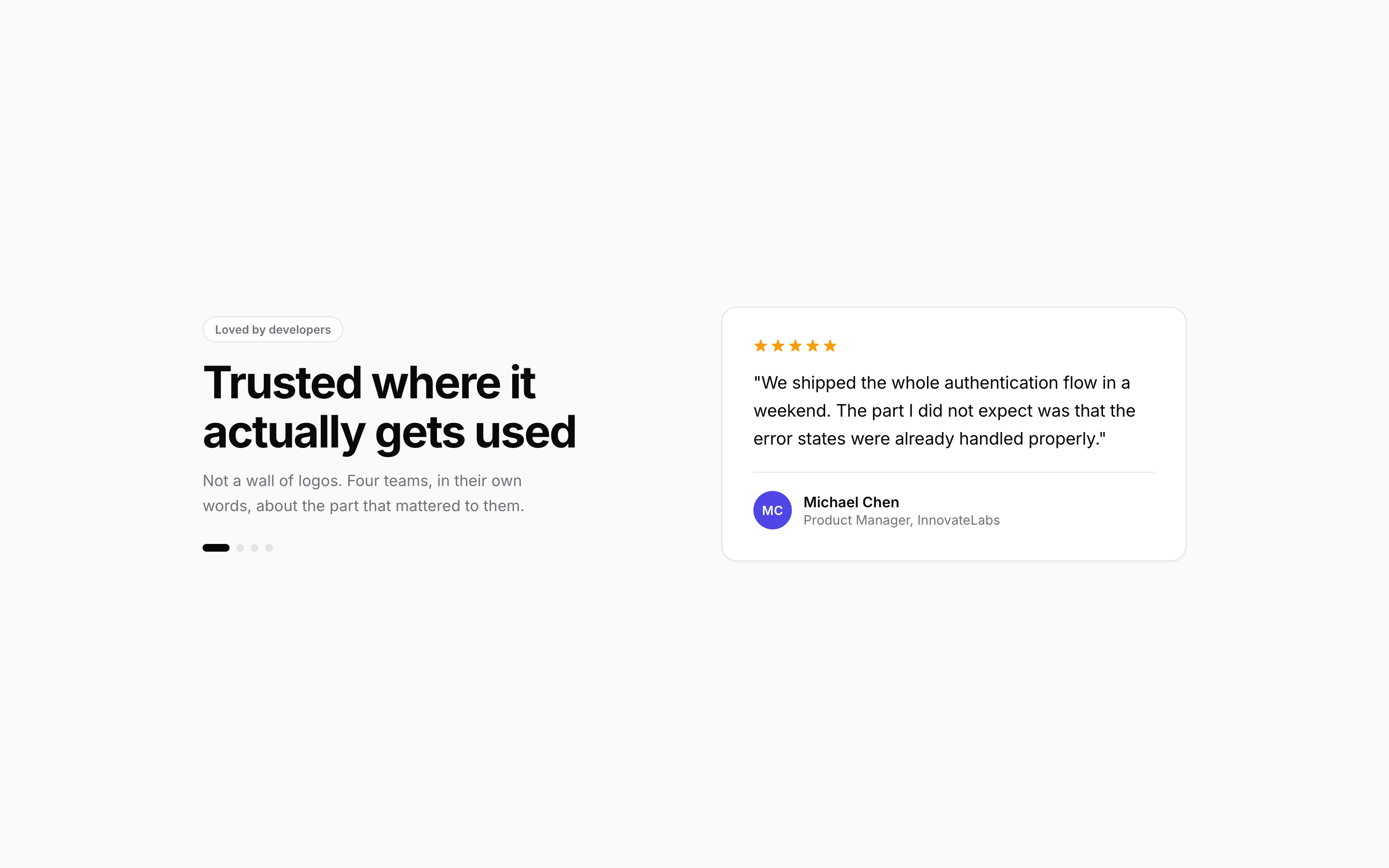
A self-contained testimonial component. A heading and lede on the left, a quote card with a star rating on the right, changed by dot pagination. The card carries five stars, the quote, and an avatar built from initials so the component ships with no image dependency. Dots are real buttons with aria-current. Content cross-fades rather than snapping. The page contains the component and nothing else, so it can be lifted straight into a section.

=== STYLE & DIRECTION ARTISTIQUE ===
• description: Light shadcn section register: a near-white ground, white cards, 1px hairline borders, 12 to 16px radii, one indigo accent, and Inter at 400 to 700. No shadows beyond a 1px lift, no gradients used as decoration, no photography.
• prompt: Ground #FAFAFA, card #FFFFFF, ink #09090B, muted #71717A, border #E4E4E7, accent #4F46E5. Inter 400 for body, 600 for names and titles, 700 for the heading. Radii 12 to 16px, borders 1px, and a single 0 1px 2px rgba(9,9,11,.04) lift on cards. Draw avatars from initials on a coloured disc rather than loading images, so the component has no asset dependency. Ease everything with cubic-bezier(.16,1,.3,1).

=== STRUCTURE & SECTIONS ===
• description: The card carries five stars, the quote, and an avatar built from initials so the component ships with no image dependency. Dots are real buttons with aria-current. Content cross-fades rather than snapping.
• prompts: [{"part":"Component","prompt":"The card carries five stars, the quote, and an avatar built from initials so the component ships with no image dependency. Dots are real buttons with aria-current. Content cross-fades rather than snapping."},{"part":"Responsive","prompt":"Reflow rather than shrink: horizontal rails become vertical rails, multi-column grids drop columns progressively, and nothing is allowed to overflow the viewport at 390px."},{"part":"Reduced motion","prompt":"Under prefers-reduced-motion, remove the motion mechanic entirely and show a plain readable equivalent. A magnifying rail or a rotating ring frozen mid-animation is unusable; a list is not."}]

=== COMPOSANTS CLÉS ===
• A heading and lede on the left, a quote card with a star rating on the right, changed by dot pagination.
• Initial-based avatars with no image dependency
• Reduced-motion fallback that changes the layout, not just the timing

=== NOTES TECHNIQUES ===
Single self-contained HTML file; one Google Fonts link is the only external request. Do not auto-advance a carousel that has explicit controls; it fights the reader mid-sentence. Note that .av is a span, so a rule like .by span at (0,1,1) will beat .av at (0,1,0) and silently grey out the initials. Verify horizontal overflow at 1440, 768 and 390 by comparing documentElement.scrollWidth against innerWidth, because a clipped child can look correct while the document scrolls sideways.
Superdesign UI · Texte publié par la source. Les références et réglages peuvent être nécessaires ; le résultat identique n’est pas garanti.
La source est indiquée pour consulter le contexte et les conditions de réutilisation.
← Continuer à explorer