
PROMPT PUBLIÉ PAR LA SOURCE
=== ARCHITECTURE & VISION ===
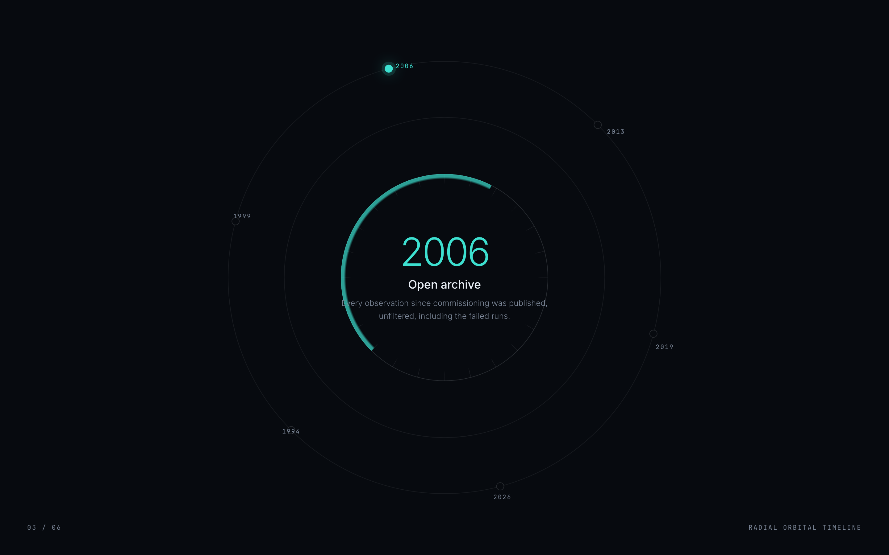
A self-contained timeline component. A dark ring of nodes that rotates on scroll so the active entry sits at the top. Nodes are placed by rotation and counter-rotated so they never appear tilted. A thin conic arc tracks progress and the hub cross-fades to the active entry. Under reduced motion the ring is removed entirely and a plain vertical list is shown, because a rotating ring with no motion is unusable. The page contains the component and nothing else, so it can be lifted straight into a section.

=== STYLE & DIRECTION ARTISTIQUE ===
• description: Light shadcn section register: a near-white ground, white cards, 1px hairline borders, 12 to 16px radii, one indigo accent, and Inter at 400 to 700. No shadows beyond a 1px lift, no gradients used as decoration, no photography.
• prompt: Ground #FAFAFA, card #FFFFFF, ink #09090B, muted #71717A, border #E4E4E7, accent #4F46E5. Inter 400 for body, 600 for names and titles, 700 for the heading. Radii 12 to 16px, borders 1px, and a single 0 1px 2px rgba(9,9,11,.04) lift on cards. Draw avatars from initials on a coloured disc rather than loading images, so the component has no asset dependency. Ease everything with cubic-bezier(.16,1,.3,1).

=== STRUCTURE & SECTIONS ===
• description: Nodes are placed by rotation and counter-rotated so they never appear tilted. A thin conic arc tracks progress and the hub cross-fades to the active entry. Under reduced motion the ring is removed entirely and a plain vertical list is shown, because a rotating ring with no motion is unusable.
• prompts: [{"part":"Component","prompt":"Nodes are placed by rotation and counter-rotated so they never appear tilted. A thin conic arc tracks progress and the hub cross-fades to the active entry. Under reduced motion the ring is removed entirely and a plain vertical list is shown, because a rotating ring with no motion is unusable."},{"part":"Responsive","prompt":"Reflow rather than shrink: horizontal rails become vertical rails, multi-column grids drop columns progressively, and nothing is allowed to overflow the viewport at 390px."},{"part":"Reduced motion","prompt":"Under prefers-reduced-motion, remove the motion mechanic entirely and show a plain readable equivalent. A magnifying rail or a rotating ring frozen mid-animation is unusable; a list is not."}]

=== COMPOSANTS CLÉS ===
• A dark ring of nodes that rotates on scroll so the active entry sits at the top.
• Initial-based avatars with no image dependency
• Reduced-motion fallback that changes the layout, not just the timing

=== NOTES TECHNIQUES ===
Single self-contained HTML file; one Google Fonts link is the only external request. Mask the progress arc with radial-gradient(circle closest-side ...). The default farthest-corner sizing puts a 47% stop at roughly 33% of the width and the thin arc renders over 100px thick. Verify horizontal overflow at 1440, 768 and 390 by comparing documentElement.scrollWidth against innerWidth, because a clipped child can look correct while the document scrolls sideways.
Superdesign UI · Texte publié par la source. Les références et réglages peuvent être nécessaires ; le résultat identique n’est pas garanti.
La source est indiquée pour consulter le contexte et les conditions de réutilisation.
← Continuer à explorer